
Typography is more than just letterforms—it’s a visual language that carries weight, movement, and emotion. In this project, I explored the intersection of formstorming and semiotics, shaping words into their inherent meanings.
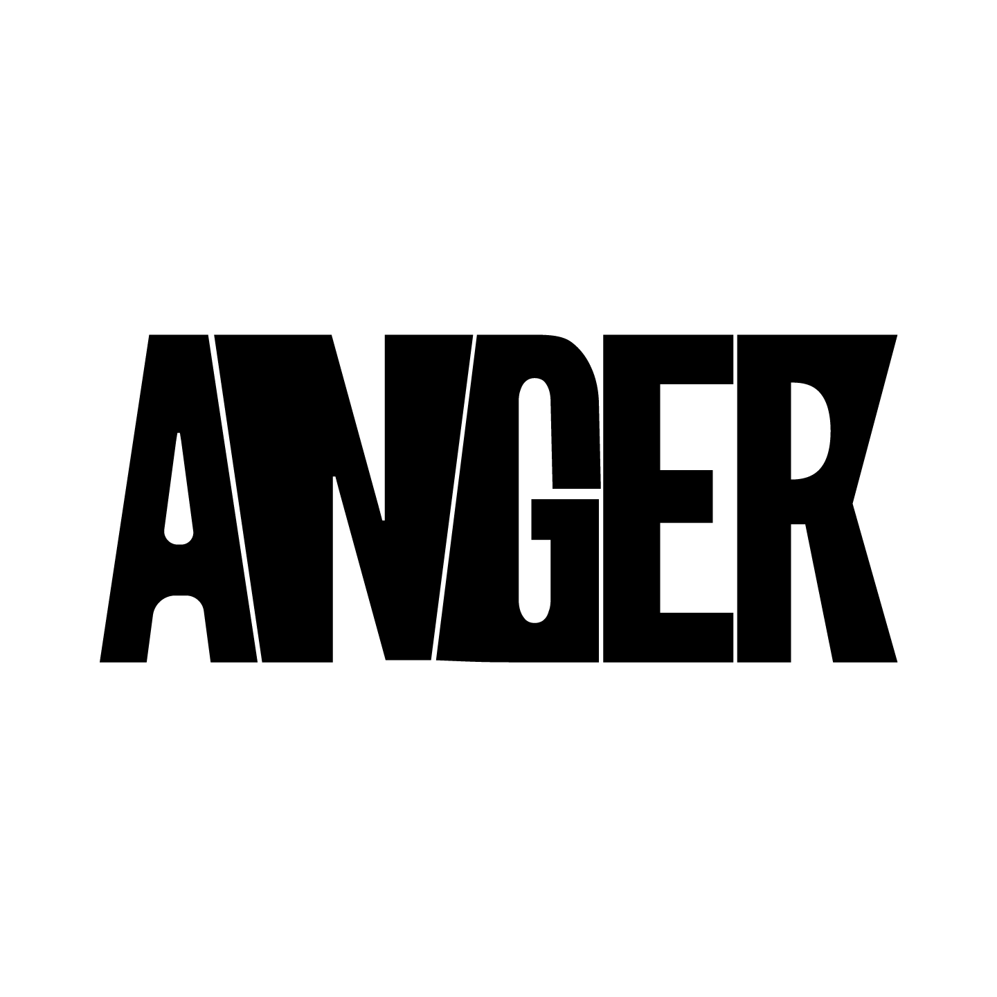
ANGER: A word that doesn’t just sit on the page—it pushes, expands, collides. The sharp edges and tension between letters create a sense of compression, echoing the sensation of rage:
a force barely contained.
CAPTIVE: Trapped between vertical and horizontal bars, "captive" is visually restrained. The letterforms are fractured, intersected, and restricted—mirroring physical or psychological confinement.
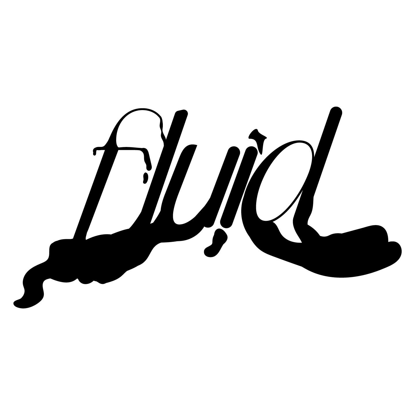
FLUID: A word that resists rigidity. The flowing, almost liquid-like typography mimics the ink, water, or identity movement. It drips, expands, and morphs—ever-evolving.
This typographic study examines how form influences perception, showing that language is more than words—motion, feeling, and intent.